| A customer wanted decals for B-24J-1-CO serial number 42-72975, of the 38BS / 30BG, nicknamed 'The Pacific Avenger'. He wanted to present a 1/72 scale model of the aircraft to the family of a crew member. This page shows the work involved in making that decal set. |
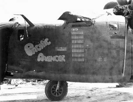
| This is a near-perfect photo (source) to recreate the markings. It is a very good start for a project like this, better than usual. However, the resolution is pretty low, and that increases the work, since more guessing is involved. Just as an example, you cannot see whether each letter is completely surrounded by a thin stripe, and how wide that pinstripe would be. |
|
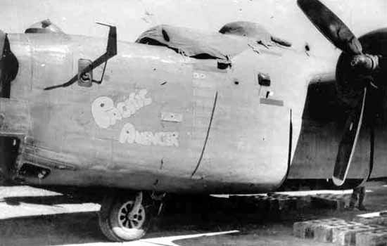
| Another good view (source), with a brighter exposure, but at an angle which introduces perspective. That can be taken out, but the less manipulation, the better. The photo confirms that there was a pinstripe around each letter. |
| A third photo (source) shows vastly different 'colors' of the lettering. It's probably an orthochromatic photo, an older type of film, that shows red as very dark grey and blue as light grey. The previous two photos can now be identified as panchromatic photos, a newer type of film that gives a much better grey value representation of all colors. Having photos of both orthochromatic and panchromatic type is actually a help, and makes me suspect the markings were orange. | 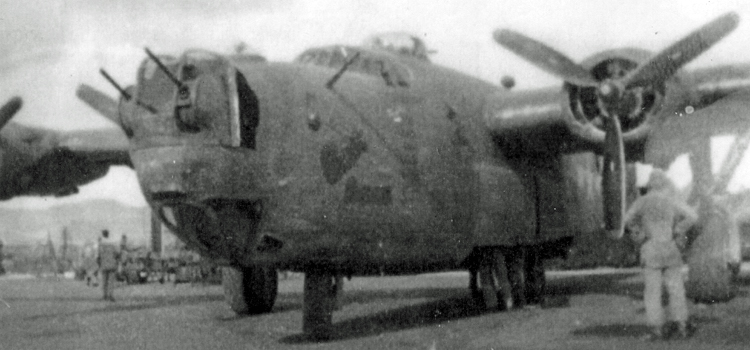
|
| Yet another photo (source), of excellent quality, that shows the lettering well. There's also a different mission score visible. |
| This is the single photo (source) of the markings on the right side of the fuselage. It was clearly made from the rear, so there is some perspective in the photo. The panel lines visible will be a great help to eliminate the perspective. | 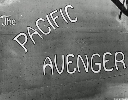
|
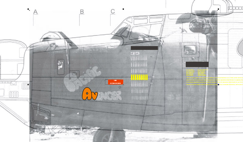
| I use an old version of CorelDraw, a popular vector graphics software. For the left side, I used the photo shown first, but it would not fit well 'under' the B-24 line drawing. I had to stretch it vertically to make it fit somewhat in both directions. The photo resolution was on the low side, it was difficult to see the finer details. Next, I started drawing the individual letters. I spent twenty minutes on two letters, and there are fourteen of them, so that alone is roughly two hours of drawing. |
| Every time I looked at the lettering and compare it to the photo, I would find small things to improve. Some example: the first A should be bigger to fill the gap with the P, I see now that the last E should extend a bit on the lower side, and line up with the lower side of the R. Or the R is too tall. But it also shows that some guessing is involved due to the limited resolution. | 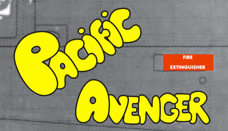
|
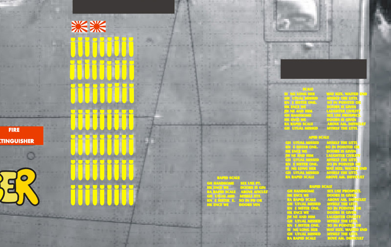
| Regarding the bomb symbols: I made the top three rows a bit messy, and the lower four rows perfectly aligned, to see what would look best in print. The large blocks of small text (probably mission details) were done with random text, since I cannot read it on the photo. A problem might be that the 0.5 mm lettering is readable for someone with good eyes. I don't know what the black(ish) rectangles are. |
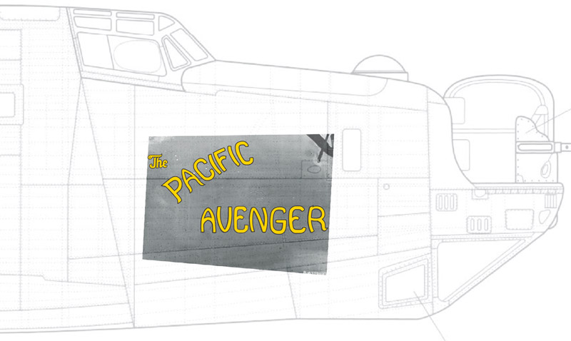
| On the right side, the aircraft had different artwork. You can see how the original photo was rotated and distorted. By taking out perspective and rotation of the photo, I was able to locate the markings precisely on the line drawing, with matching panel lines. Otherwise I would not have known the actual size of the markings. | 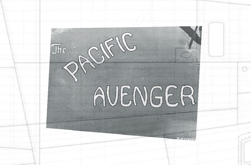
|
| The lettering was then hand-drawn over the photo, another laborious job. |
| There is no photo showing the serial number, its size and location, etc. I therefore based it on other B-24Js, making the digits 12" tall. I started with the current-day USAF lettering, but changed it a bit based on photos of other B-24s. I also made the numbers a little fatter. The unit markings were based on this source, but the color was changed from black to white, again working from photos. | 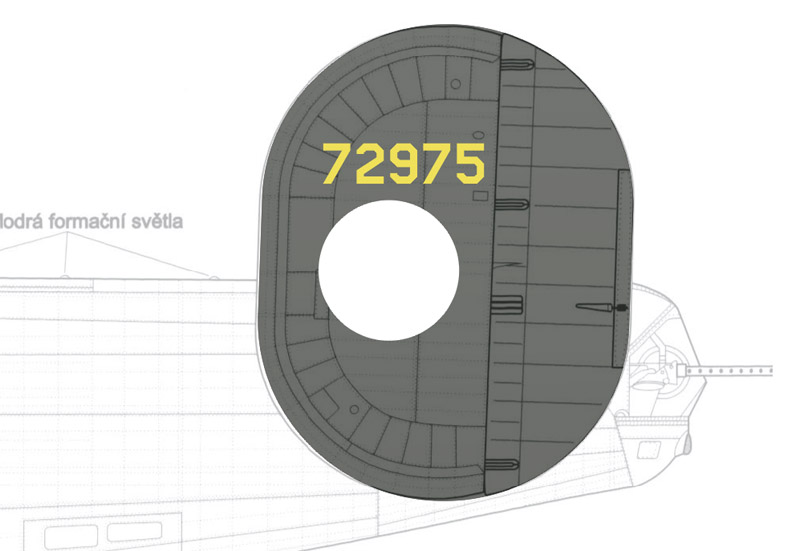
|
| After the artwork is finished, there is one more step: to prepare the artwork for decal printing. The preparations depend on the custom decal printing company, and the printer they use. I had these decals printed by SpotModel in Spain, and they supply a template with instructions. According to these instructions, I made three layers, shown staggered here: the bottom layer with a white undercoat, a middle layer with the artwork, and a top layer with the outline of the decal film. I generally make the decal film 0.5 mm larger all around. | 
|
| Here's the end result of the artwork phase, with purple representing the clear film. On request I changed part of the chrome yellow artwork to a lighter color, simulating a sun-bleached color.
It's a double set, since the printing costs are relatively low, compared to the nuisance of a decal ruined during application. Most of the costs are drawing time, as you will understand from the above. I spent four to five hours on the artwork in total. | 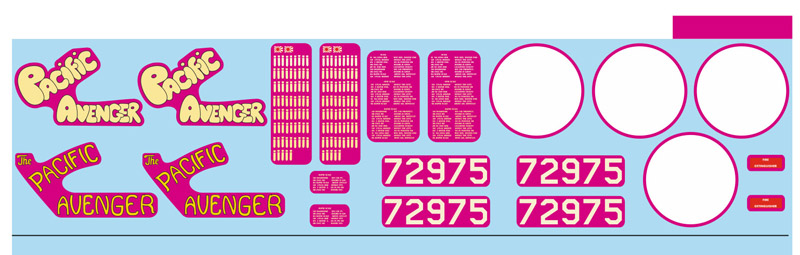
|
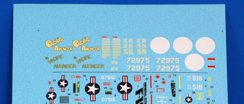
| The printed decals looked very good to my eye. SpotModel-printed decals are easy to work with in my experience, although some are really thick. A peculiarity is that the decals grow some 9% when wetted. Spotmodel therefore prints them 9% smaller than the submitted artwork. This can lead to confusion when one does a dry testfit of the decals on the model. |