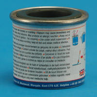
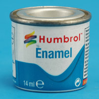
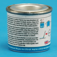
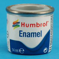
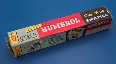
Standard range
|
 
|
| Era:
| 1937 to possibly 1941
|
| Tin shown:
| brown (Mario Wens)
|
| Front:
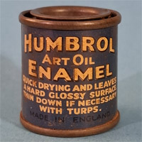
| blue background, 'Humbrol Art Oil Enamel' text in white with partial black shadow, followed by 'Quick drying and leaves a hard glossy surface. Thin down if necessary with turps.' in white, and 'Made in England' in black
|
| Back:
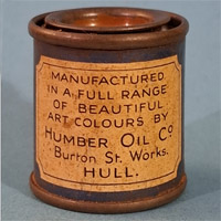
| white shield with text in black reading 'Manufactured in a full range of beautiful art colours by Humber Oil Co, Burton St Works, Hull'
|
| Label:
| printed on tin
|
| Lid:
| paint colour
|
| Comments:
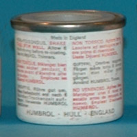
| the very first Humbrol tin design, that surfaced only in 2025, 18 years after starting this list, through the search effort of Mario Wens. The range consisted of 12 colours.
|
|
 
|
| Era:
|
|
| Tin shown:
| 1956 advertisement (Lee Harris)
|
| Front:
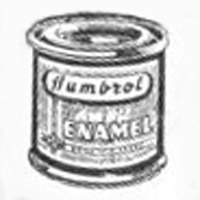
| 'Humbrol Enamel' text
|
| Back:
|
|
| Label:
|
|
| Lid:
|
|
| Comments:
| note the very different Humbrol logo, in italics and mixed upper and lower case
|
|
 
|
| Era:
|
|
| Tin shown:
|
|
| Front:
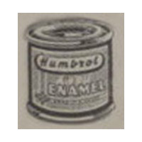
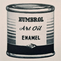
| see next design. This one had fewer gold stripes, and the black band is taller.
|
| Back:
| unknown
|
| Label:
|
|
| Lid:
|
|
| Comments:
| it's not clear yet whether this design was just a drawing in an advertisement, or a real tin design. The front side only differs from the next design show by its smaller 'HOC' label. The size of that label varied with each tin design, it seems.
|
|
 
|
| Era:
| 1956 and 1958 advertisements
|
| Tin shown:
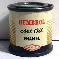
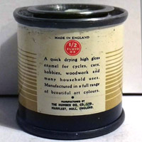
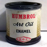
| 23 Duck Egg Blue matt (Lee Harris)
|
| Front:
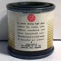
| 'Humbrol' text in the red logo type that is still used, 'Art oil' and 'Enamel' texts in black, 'HOC' logo in red. Background is white with golden stripes and a black band at the bottom
|
| Back:
| text in English only, '1/2 fl. oz. imp'
|
| Label:
| printed on tin
|
| Lid:
| paper label ?
|
| Comments:
| the design of this tin reflects nearly all elements of some Britfix products, like a bicycle tyre repair set: white background with golden horizontal stripes, black band at the bottom, black product text and red logo. Bottom is attached with a flange, this is not a deep drawn tin. "20 colours to choose from" in April 1956 advertisement
|
|
 
|
| Era:
| 1956 and 1958 advertisements
|
| Tin shown:
| 21 Gloss Black (Lee Harris)
|
| Front:
| same as above, but 10% larger. Gold stripes are narrower at the top
|
| Back:
| same as above, but slightly larger
|
| Label:
| printed on tin
|
| Lid:
| paint colour
|
| Comments:
| same as above
|
|
 
|
| Era:
| 1959, 1960 and 1961 advertisements
|
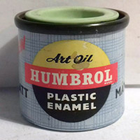
| Tin shown:
| 21 Gloss Black (Lee Harris)
|
| Front:
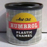
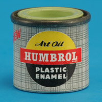
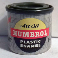
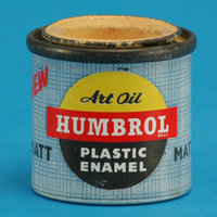
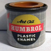
| logo consisting of a yellow and black circle with a red horizontal bar with 'Humbrol' text. 'Art oil' text in yellow part, 'Plastic enamel' text in black part. Tartan-like background in very light and dark grey. 'New' in red on the left side in
|
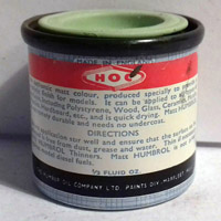
| Back:
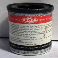
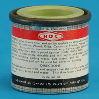
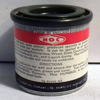
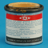
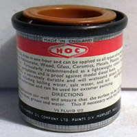
| red band with HOC logo and texts 'lead free' and 'dries in minutes'. Instructions in English
|
| Label:
| printed on tin
|
| Lid:
| paint colour
|
| Comments:
| the first deep drawn tin type. The tin is slightly taller than later tins, at 29.5 to 30 mm between the flange and the bottom. The bottom of the tins was painted white. Range of 34 colors. The design of this tin copied nearly all elements of Britfix products, like the bicycle tyre repair set: the grey tartan background, the yellow & black circle, and the company name in white on a red background.
|
|
 
|
| Era:
| 1959, 1960 and 1961 advertisements
|
| Tin shown:
| 1 Eau de Nil (Huub van Dijk)
|
| Front:
| same as above
|
| Back:
| same as above, but with a narrower red band, and 'lead free' and 'dries in minutes' in the red band deleted
|
| Label:
| same as above
|
| Lid:
| paint colour
|
| Comments:
| same as above. Height is 29.5 to 30 mm between the flange and the bottom. A much larger version also exists, volume to be determined.
|
|
 
|
| Era:
| 1959, 1960 and 1961 advertisements
|
| Tin shown:
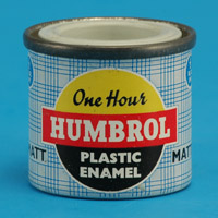
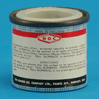
| 33 Matt Black (Lee Harris)
|
| Front:
| same as above, but with 'MATT' on either side of the Humbrol logo. The tartan pattern is in very light and dark grey.
|
| Back:
| same as above
|
| Label:
| printed on tin
|
| Lid:
| paint colour
|
| Comments:
| same as above. Height is 29.5 to 30 mm between the flange and the bottom.
|
|
 
|
| Era:
| 1959, 1960 and 1961 advertisements
|
| Tin shown:
| 17 Satin Flesh (Huub van Dijk)
|
| Front:
| same as above, but with 'MATT' on either side of the Humbrol logo, and the tartan pattern is blue on white
|
| Back:
| same as above
|
| Label:
| printed on tin
|
| Lid:
| paint colour
|
| Comments:
| same as above. Height is 29.5 to 30 mm between the flange and the bottom.
|
|
 
|
| Era:
| 1959, 1960 and 1961 advertisements
|
| Tin shown:
| 9 Gloss Tan (Lee Harris)
|
| Front:
| same as two tins above
|
| Back:
| same as two tins above
|
| Label:
| same as two tins above
|
| Lid:
| paint colour
|
| Comments:
| The tin is slightly lower than the previous tins, at 28.5 to 29 mm between the flange and the bottom. Whether it's the oldest or newest of the two is a bit of a guess, but since subsequent tins have the same size, the best guess it's the newest of the two.
|
|
 
|
| Era:
| 1959, 1960 and 1961 advertisements
|
| Tin shown:
| 23 Matt Duck Egg Blue (Lee Harris)
|
| Front:
| same as two tins above
|
| Back:
| same as two tins above
|
| Label:
| same as two tins above
|
| Lid:
| paint colour
|
| Comments:
| the tin is slightly lower version of three tins above, at 28.5 to 29 mm between the flange and the bottom.
|
|
 
|
| Era:
|
|
| Tin shown:
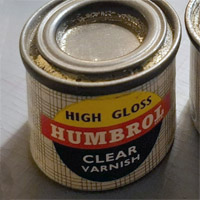
| (35) Gloss clear (Mario Wens)
|
| Front:
| same above, but 'Art Oil' replaced by 'High Gloss', and similarly 'Plastic Enamel' by 'Clear Varnish'
|
| Back:
|
|
| Label:
| printed on tin
|
| Lid:
| bare metal
|
| Comments:
|
|
|
 
|
| Era:
|
|
| Tin shown:
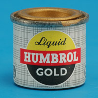
| ? (Lee Harris)
|
| Front:
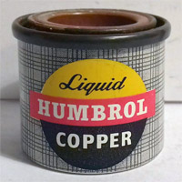
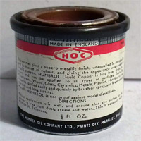
| same basic design as above, but with 'Liquid' instead of 'One Hour' and the colour (Gold / Silver / Copper) instead of 'Plastic Enamel'. The Humbrol lettering is slightly smaller than the next tin design.
|
| Back:
| looks mostly like the tin below
|
| Label:
| printed on tin
|
| Lid:
| paint colour
|
| Comments:
| fits in with the above two tins. It is an aluminium tin with white-painted or unpainted bottom.
|
|
 
|
| Era:
| 1960, 1961, 1962
|
| Tin shown:
| 6 Gloss Pale Cream (Huub van Dijk)
|
| Front:
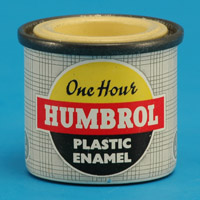
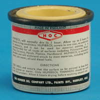
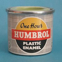
| logo consisting of a yellow and black circle with a red horizontal bar with 'Humbrol' text. Humbrol text is taller than before. 'One Hour' text in yellow part, 'Plastic enamel' text in black part. A white border surrounds the circle and the bar. Tartan-like background in very light and dark grey.
|
| Back:
| instructions in English, '1/2 fl. oz. imp' on the side. The red band at the top has been made roughly half the previous height
|
| Label:
| printed on tin
|
| Lid:
| paint colour
|
| Comments:
| all tins from now on are of the 'lower' type, at 28.5 to 29 mm between the flange and the bottom. Also, the material of the deep-drawn part was changed from aluminium to steel. The flange and lid remained steel.
|
|
 
|
| Era:
|
|
| Tin shown:
| light grey (Huub van Dijk)
|
| Front:
| same as above, but with 'Matt' on either side of the Humbrol logo, and the tartan pattern is blue on white
|
| Back:
| same as above
|
| Label:
| printed on tin
|
| Lid:
| paint colour
|
| Comments:
| the blue tartan pattern indicates a matt colour
|
|
 
|
| Era:
|
|
| Tin shown:
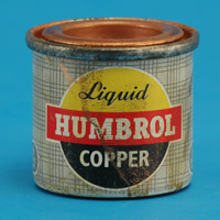
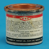
| 12 Metallic Copper (Huub van Dijk)
|
| Front:
| same basic design as above, but with 'Liquid' instead of 'One Hour' and the colour (Gold / Silver / Copper) instead of 'Plastic Enamel'. '1/2 Fl. Oz. Imp.' in two circles on the sides (barely visible in photo)
|
| Back:
| same as above
|
| Label:
| printed on tin
|
| Lid:
| paint colour
|
| Comments:
|
|
|
 
|
| Era:
| 1962, 1965 advertisements
|
| Tin shown:
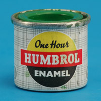
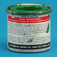
| 2 Gloss Emerald Green (Huub van Dijk)
|
| Front:
| Same as before, 'Plastic Enamel' text replaced by 'Enamel'
|
| Back:
| instructions in English, '14 c.c.' on one side and '1/2 fl. oz. imp' on the other side
|
| Label:
| printed on tin
|
| Lid:
| paint colour
|
| Comments:
| (( Range consisted of 34 colours. ))
|
|
 
|
| Era:
|
|
| Tin shown:
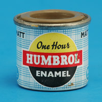
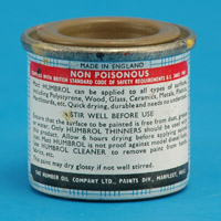
| 29 Matt Dark Earth (Huub van Dijk)
|
| Front:
| same as above, but with 'Matt' to the right of the Humbrol logo, and the tartan pattern is blue on white
|
| Back:
| instructions in English, '14 c.c.' on one side and '1/2 fl. oz. imp' on the other side
|
| Label:
| printed on tin
|
| Lid:
| paint colour
|
| Comments:
| the blue tartan pattern indicates a matt colour
|
|
 
|
| Era:
|
|
| Tin shown:
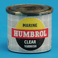
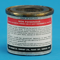
| 35 Gloss Clear (Rob de Bie)
|
| Front:
| same above, but 'One Hour' replaced by 'Marine', and similarly 'Plastic Enamel' by 'Clear Varnish'
|
| Back:
| instructions appear to be different from the regular 'One hour' tins
|
| Label:
| printed on tin
|
| Lid:
| bare metal with embossed 'Clear 35'
|
| Comments:
| possibly the 'Marine' text was a marketing ploy, to attract builders of remotely controlled ship models? Considering the rarity of these 'Marine' tins, it may have been short-lived.
|
|
 
|
| Era:
|
|
| Tin shown:
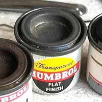
| 36 (?) Flat Finish (via Matchbox Mike)
|
| Front:
| same basic design, but 'Transparent' in the same font as 'Liquid' on the tin below, and 'Flat Finish'. The tartan pattern is blue on white, signaling a matt paint
|
| Back:
| unknown
|
| Label:
| printed on tin (most likely)
|
| Lid:
| bare metal
|
| Comments:
| yet another variant of the 'One Hour' tins
|
|
 
|
| Era:
|
|
| Tin shown:
| 16 Metallic Gold (Huub van Dijk)
|
| Front:
| same as above, but with '1/2 Fl. Oz. Imp.' in circle on left-hand side, '14cc' in circle on right-hand side (barely visible in photo)
|
| Back:
| HOC logo deleted, 'Non poisonous' added, slightly more text
|
| Label:
| printed on tin
|
| Lid:
| paint colour
|
| Comments:
|
|
|
 
|
| Era:
| appears to have been introduced in 1965. 1965 and 1967 advertisements
|
| Tin shown:
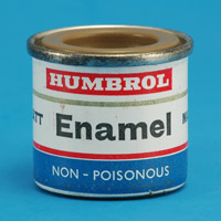
| 13 Gloss Sky Blue (Eric Verschuur)
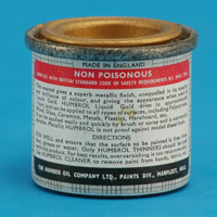
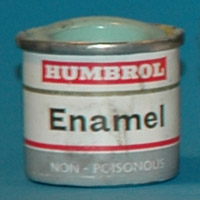
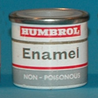
|
| Front:
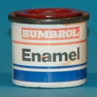
| white on red Humbrol logo, then a gold band, 'Enamel' text, red band and lastly a grey band with 'Non-poisonous' text.
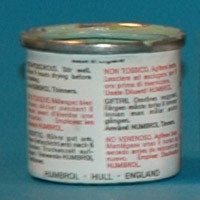
|
| Back:
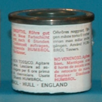
| text in six languages on rear side: English, French, German, Italian, Swedish and Spanish.
|
| Label:
| printed on tin
|
| Lid:
| paint colour
|
| Comments:
| the design of this tin reflects nearly all elements of some Britfix products, like a bicycle tyre repair set: white on red logo, a gold band, product name text, and lastly a grey and a red band at the bottom. (( Range expanded to 49 colours. ))
|
|
 
|
| Era:
| May 1970, 1972, 1975 and 1978 included
|
| Tin shown:
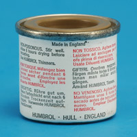
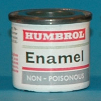
| 64 Matt Light Grey (Eric Verschuur)
|
| Front:
| grey band no longer extends to the bottom of tin
|
| Back:
| 'Shake then stir well' (in red capital text) instead of 'Stir well', but not in the other languages!
|
| Label:
| printed on tin
|
| Lid:
| paint colour
|
| Comments:
| (((( Range expanded to 80 colours (numbers go up to 99). ))))
|
|
 
|
| Era:
| 1971 advertisement
|
| Tin shown:
| 29 Matt Dark Earth (Huub van Dijk)
|
| Front:
| white on red Humbrol logo, 'MATT' to the right, then a gold band, 'Enamel' text, red band and lastly a blue band with 'Non-poisonous' text
|
| Back:
| text in six languages on rear side: English, French, German, Italian, Swedish and Spanish.
|
| Label:
| printed on tin
|
| Lid:
| paint colour
|
| Comments:
| the blue band indicates a matt colour, as with the 'Art oil' and 'One hour' series. However, matt colours were also sold in the 'grey band' tin shown above. Judging from the relative small number of this type of tins in various collections, it could be a short-lived variant
|
|
 
|
| Era:
| 1978-1980 included
|
| Tin shown:
| 91 Matt Black Green (Andre Hoogstad)
|
| Front:
| front side reduced to 1/3 of circumference, to make room for more text on the back. Gold band under Humbrol prone to fading
|
| Back:
| three columns of text. Text identical but larger
|
| Label:
| printed on tin
|
| Lid:
| paint colour
|
| Comments:
| (( Range expanded to 80 colours (numbers go up to 99), possibly in 1978 (brochure proudly shows the figure '80' made from tins . ))
|
|
 
|
| Era:
| 1982 advertisement
|
| Tin shown:
| 20 Gloss Crimson (Rob de Bie)
|
| Front:
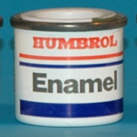
| front side increased to roughly 45% of circumference. 'Non-poisonous' label deleted. Blue band could be an indication that the paint formulation was changed somewhat (thinning is best done with Humbrol thinner or alternatively white spirit)
|
| Back:
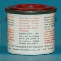
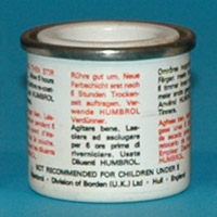
| text made slighter smaller, and 'non-poisonous' text deleted from all languages. 'Division of Borden (UK) Ltd' added
|
| Label:
| printed on tin
|
| Lid:
| paint colour
|
| Comments:
| range expanded to 116 colours (numbers go up to 135) around 1983-1985
|
|
 
|
| Era:
|
|
| Tin shown:
| 105 Matt Marine Green (Rob de Bie)
|
| Front:
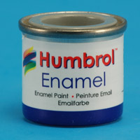
| white on red Humbrol logo changed to red Humbrol lettering. Red-white-blue banner added, blue banner at bottom simplified. Alternatively you can say the narrow blue band moved upwards. 'Enamel' text slightly larger and fatter
|
| Back:
|
|
| Label:
| printed on tin
|
| Lid:
| white with paper coloured paper sticker
|
| Comments:
|
|
|
 
|
| Era:
| 1993 advertisment
|
| Tin shown:
| 127 Satin U.S. Ghost Grey (Andre Hoogstad)
|
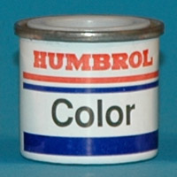
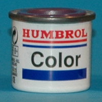
| Front:
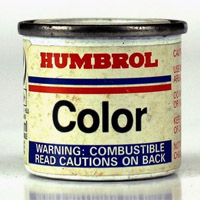
| 'Enamel' replaced by 'Color', possibly because the word 'enamel' was not understood outside the UK
|
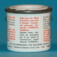
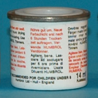
| Back:
| 'Division of Borden (UK) Ltd' removed
|
| Label:
| printed on tin
|
| Lid:
| white with coloured paper sticker
|
| Comments:
| (( Range expanded to 184 colours (numbers go up to 209) to include part of the deleted Authentics paint range. ))
|
|
 
|
| Era:
|
|
| Tin shown:
| 68 Gloss Purple (Rob de Bie)
|
| Front:
| front side made narrower, roughly 30% of circumference, to make room for the back side
|
| Back:
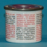
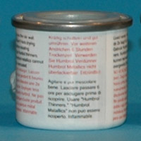
| additional column with recycling symbol, age statement and other text. 'Humbrol metallics cannot be overcoated' text added to all languages.
|
| Label:
| shrink plastic
|
| Lid:
| paint colour (coloured paper stickers were also used)
|
| Comments:
| (( Range expanded to 184 colours (numbers go up to 209) to include part of the deleted Authentics paint range. ))
|
|
 
|
| Era:
|
|
| Tin shown:
| 87 Matt Steel Grey (Andre Hoogstad)
|
| Front:
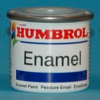
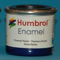
| Humbrol logo enhanced with multi-coloured paint 'scribble' on the left side. 'Color' replaced by 'Enamel' as before. Red stripe under 'Humbrol' deleted. Text 'Enamel Paint Peinture Email Emailfarbe' added below blue band
|
| Back:
| 'flammable' warnings are added. Fonts made smaller and leaner.
|
| Label:
| shrink plastic
|
| Lid:
| paint colour
|
| Comments:
| Range reduced to 140 colours (numbers go up to 250).
|
|
 
|
| Era:
| 1997 included
|
| Tin shown:
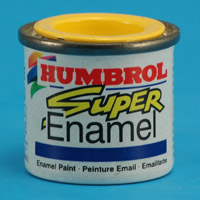
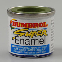
| 69 Gloss Yellow (Rob de Bie)
|
| Front:
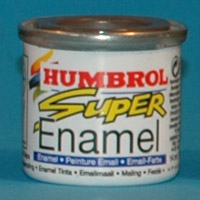
| basically as above, but with 'Super' text added in yellow, and 'Enamel' placed lower
|
| Back:
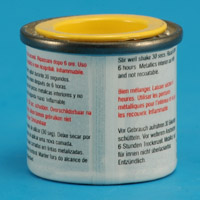
| text in two columns, seven languages
|
| Label:
| shrink plastic
|
| Lid:
| paint colour
|
| Comments:
| introduction of 'Super Enamel' formulation. 15 micron colour particle size. Range expanded to 151 colours (numbers go up to 250). As compensation for the previous reduction Humbrol issued a 'Super Paint Colour System' / 'Colour Mixing binder' with mixing instructions for many military colours. Although very accurate, this was not popular with modelers.
|
|
 
|
| Era:
|
|
| Tin shown:
| 170 Matt Brown Bess (Rob de Bie)
|
| Front:
| same as above, but the blue bar now contains 'Enamel - Peinture Email - Email-Farbe' text
|
| Back:
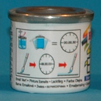
| barcode added, pictograms instead of text showing mixing and drying instructions
|
| Label:
| shrink plastic
|
| Lid:
| paint colour
|
| Comments:
|
|
|
 
|
| Era:
| 2002, 2004 included
|
| Tin shown:
| 126 Satin U.S. Medium Grey (Rob de Bie)
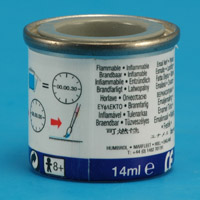
|
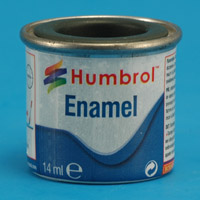
| Front:
| red 'Humbrol' with a blue shadow, slightly larger fonts used
|
| Back:
| chemicals and allergy warning removed, just 'flammable - inflammable' in nine languages
|
| Label:
| shrink plastic
|
| Lid:
| paint colour
|
| Comments:
| maybe this tin was produced simultaneously with the one below? This would then be the 'world' version, the tin below the 'Euro' version
|
|
 
|
| Era:
| 2005, 2006 included
|
| Tin shown:
| 33 Matt Black (Rob de Bie)
|
| Front:
| slightly smaller fonts used
|
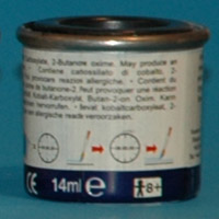
| Back:
| chemicals added, allergy warning, possibly because of EU regulations?
|
| Label:
| shrink plastic
|
| Lid:
| paint colour
|
| Comments:
| reportedly produced in China with resulting quality problems. Range extended with 13 new colours (173 and 237-249) in, probably around November 2012 (Telford IPMS UK)
|
|
 
|
| Era:
|
|
| Tin shown:
| 241 Matt RLM 70 Schwarzgrun (Rob de Bie)
|
| Front:
| blue 'wave' at the bottom
|
| Back:
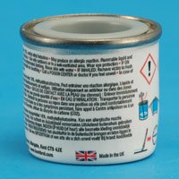
| covers 2/3rds of the tin now. Left side contains mainly safety warnings in English, French and Dutch in a red rectangle, red and yellow Hornby logo at the bottom. Right side has the same pictograms as before, plus UK flag and 'Made in the UK' text. Media reports from November 2012 state that production was moved from China to Rustins Ltd in Cricklewood (UK). Most likely production was started July 2012, still using the previous tin design.
|
| Label:
| shrink plastic
|
| Lid:
| paint colour
|
| Comments:
|
|
|
 
|
| Era:
|
|
| Tin shown:
| 11 Metallic Silver (Rob de Bie)
|
| Front:
| magenta 'wave' at the bottom
|
| Back:
| same as above, but both text and pictograms are now contained in a single black rectangle
|
| Label:
| shrink plastic
|
| Lid:
| paint colour
|
| Comments:
| the tin shape is slightly different: instead of a straight taper, the bottom half now has more curvature
|
|
 
|
| Era:
| 2017 included
|
| Tin shown:
| 127 Satin U.S. Ghost Grey (Rob de Bie)
|
| Front:
| wave color back to blue
|
| Back:
| same as above, but the black rectangle is deleted. No logo for Hornby, just the text 'Hornby Hobbies'. Blue band at the bottom deleted
|
| Label:
| shrink plastic
|
| Lid:
| paint colour
|
| Comments:
| continuation of the new tin shape
|
|
 
|
| Era:
| 2017 included
|
| Tin shown:
| 127 Satin U.S. Ghost Grey (Rob de Bie)
|
| Front:
| blue wave, 'Enamel' in blue, 'Humbrol' in red, similar to previous designs
|
| Back:
| pictograms for mixing/shaking and drying, safety warnings, Hornby logo and company data
|
| Label:
| sticker that partially covers the tin, with a peel-back layer for safety information in English, French, German, Dutch, Swedish, Italian and Spanish
|
| Lid:
| bare metal with a coloured paper sticker, with tin number in white lettering.
|
| Comments:
| return of the old tin shape with a straight (very slight) taper. Lids are no longer painted, simple coloured sticker instead
|
|
 
|
| Era:
| 2021 included
|
| Tin shown:
| 10 Gloss Service Brown (Rob de Bie)
|
| Front:
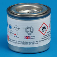
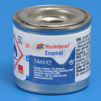
| the 'front' is now only 20% of the circumference, the rest is taken by warnings. It is a miniature version of the previous tin, with contact details below
|
| Back:
| safety warnings in English and German, no instructions for usage
|
| Label:
| sticker
|
| Lid:
| bare metal with a coloured paper sticker, with tin number in white lettering.
|
| Comments:
| the tin shown has the new label added over the previous label. Maybe the peel-back label did not conform to regulations?
|
|
Standard range - French versions
|
 
|
| Era:
|
|
| Tin shown:
| ? (Airfix Collecting forum)
|
| Front:
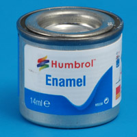
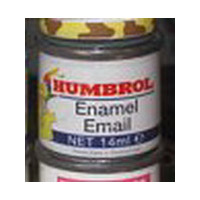
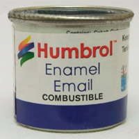
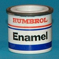
| standard Humbrol logo in white and red, 'Enamel / Email' in black (French spelling of enamel), 'Net 14 ml' followed by 'Enamel paint - Painture email'
|
| Back:
| unknown
|
| Label:
| unknown
|
| Lid:
|
|
| Comments:
|
|
|
Standard range - Dutch / Belgian versions
|
 
|
| Era:
|
|
| Tin shown:
| ? (Airfix Collecting forum)
|
| Front:
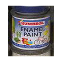
| standard Humbrol logo in white and red, 'Enamel paint' in black, 'Voor ieder klusje een Humbrol busje' ('For every job a Humbrol tinlet', a free translation of the old Humbrol slogan 'A colour for every purpose'), and a colorful background of toys and household items
|
| Back:
| unknown
|
| Label:
| unknown
|
| Lid:
|
|
| Comments:
| I've never seen this tin although I live in the Netherlands!
|
|
Standard range - US versions
|
 
|
| Era:
| early sixties
|
| Tin shown:
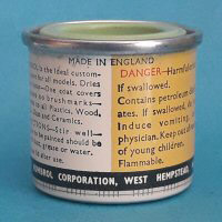
| 1 Eau-de-Nil (Mario Wens)
|
| Front:
| Identical to the regular British 'One hour - plastic enamel' version: logo consisting of a yellow and black circle with a red horizontal bar with 'Humbrol' text. 'One Hour' text in yellow part, 'Plastic enamel' text in black part. A white border surrounds the circle and the bar. Tartan-like background in very light and dark grey.
|
| Back:
| Completely different from the regular British 'One hour - plastic enamel' version: a white and a yellow panel, with respecively instructions for use and warnings. Black bar at the bottom with 'Humbrol Corporation, West Hempstead NY'
|
| Label:
| printed on tin
|
| Lid:
| paint colour
|
| Comments:
| barely visible: on the sides (3 and 9 o'clock positions) there's circle with '14 c.c.' text instead of '1/2 fl.oz.imp.' on the British tins
|
|
 
|
| Era:
|
|
| Tin shown:
| 133 Satin Brown (Lots of Models)
|
| Front:
| red Humbrol lettering, then a red-white-blue banner, 'Color' and a blue banner
|
| Back:
|
|
| Label:
| looks like a sticker, possibly wrapped around a standard European tin?
|
| Lid:
|
|
| Comments:
| looks like the ~1990 European version
|
|
 
|
| Era:
|
|
| Tin shown:
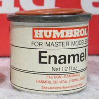
| ? (Ebay)
|
| Front:
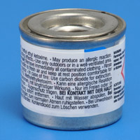
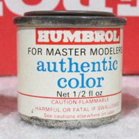
| standard Humbrol logo in white and red, 'for master modelers' in black, 'Enamel' in black, 'Net 1/2 fl oz' followed by warnings in red: 'Caution flammable - Harmful or fatal if swallowed - See cautions elsewehere on label'
|
| Back:
| unknown
|
| Label:
| unknown
|
| Lid:
|
|
| Comments:
|
|
|
 
|
| Era:
| 1997 included
|
| Tin shown:
| ? (Ebay)
|
| Front:
| similar to the 1997 UK tin, but with a larger blue area with warnings
|
| Back:
| text in English only. Left rear panel, shown in photo, consist of one line of instructions for use, the remainder are warnings. Right panel, not shown in the photo, consists of warnings only.
|
| Label:
| sticker label over shrink plastic label of the UK version
|
| Lid:
| painted in colour
|
| Comments:
|
|
|
 
|
| Era:
|
|
| Tin shown:
| ? (Sprue Brothers)
|
| Front:
| modernised Humbrol logo, red with a blue shadow; colour 'scribble' on the left side; 'Enamel' and 'Email' in blue, 'Combustible' in black; blue banner at the bottom
|
| Back:
|
|
| Label:
| sticker, possibly wrapped around a standard European tin?
|
| Lid:
|
|
| Comments:
| the tin underneath the sticker appears to be the 2006 European version
|
|
 
|
| Era:
|
|
| Tin shown:
| 84 Matt Mid Stone (Lots of Models)
|
| Front:
| as above, minus the French 'Email' and with the 'combustible' warning in a black rectangle, with 'vapor harmful, read cautions on side' text added
|
| Back:
|
|
| Label:
| sticker, possibly wrapped around a standard European tin?
|
| Lid:
|
|
| Comments:
| the tin underneath the sticker appears to be the 2006 European version
|
|
 
|
| Era:
|
|
| Tin shown:
| 24 Matt Trainer Yellow (Lots of Models)
|
| Front:
| 'Blue wave' design as on the European tins
|
| Back:
|
|
| Label:
| sticker, possibly wrapped around a standard European tin?
|
| Lid:
|
|
| Comments:
| tin looks like the 2017 tapered tin from the standard European range
|
|
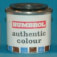
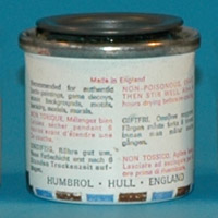
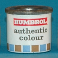
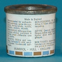
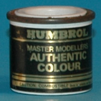
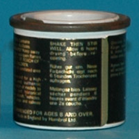
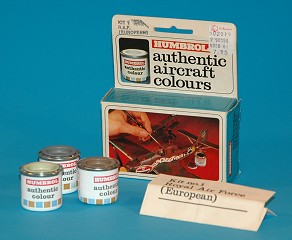
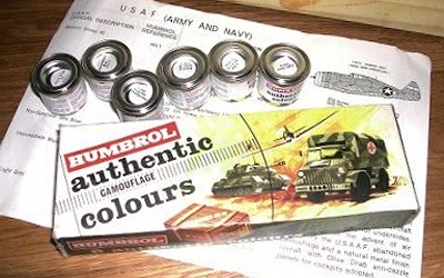
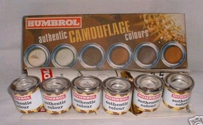
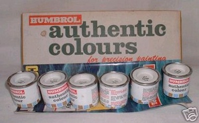
Authentic colours
|
 
|
| Era:
| shown in 1968 flyer and 1968 advertisement
|
| Tin shown:
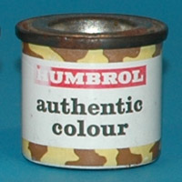
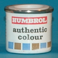
| HU1 Medium Green 42 (Rob de Bie)
|
| Front:
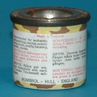
| camouflage bands circling top and bottom of the tin. Yellow and brown camouflage spots
|
| Back:
|
|
| Label:
| printed on tin
|
| Lid:
| bare metal with paper sticker
|
| Comments:
|
|
|
 
|
| Era:
| 1972 included
|
| Tin shown:
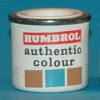
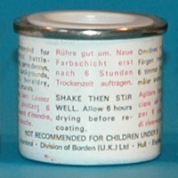
| HU4 Non Specular Sea Blue (Eric Verschuur)
|
| Front:
| three brown-blue-brown blocks at the bottom
|
| Back:
| 'Stir well' instead of 'Shake then stir well' instruction (see H13 Eric Verschuur)
|
| Label:
| printed on tin
|
| Lid:
| white with paper sticker
|
| Comments:
| judging from the relative small number of this type of tins in various collections, it could be a short-lived variant. The 'Authentics' range consisted of 22 sets of 6 colours each. The tins were available individually or as sets of 6; these sets had instructions included describing their use.
|
|
 
|
| Era:
| May 1970, 1973, 1975 and 1978 advertisements
|
| Tin shown:
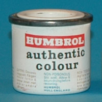
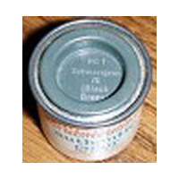
| HG1 Schwarzgrun 70 (Black Green) (Eric Verschuur)
|
| Front:
| brown-blue blocks at the bottom now circle the tin, but the height is reduced on the rear side
|
| Back:
|
|
| Label:
| printed on tin. The label on this particular tin is likely applied too low
|
| Lid:
| paint colour
|
| Comments:
|
|
|
 
|
| Era:
| May 1970, 1973, 1975, 1978 and 1979 advertisements
|
| Tin shown:
| HU1 Medium Green 42 (Andre Hoogstad)
|
| Front:
|
|
| Back:
| text all black instead of red and black
|
| Label:
| printed on tin
|
| Lid:
| paint colour
|
| Comments:
| judging from the relative small number of this type of tins in various collections, it could be a short-lived variant.
|
|
 
|
| Era:
| 1974 and 1977 advertisements
|
| Tin shown:
| HG1 Schwarzgrun 70 (Black Green) (Ebay)
|
| Front:
| standard Humbrol logo in white and red, 'for master modelers' in black, 'authentic color' in blue, 'Net 1/2 fl oz' followed by warnings in red: 'Caution flammable - Harmful or fatal if swallowed - See cautions elsewehere on label'
|
| Back:
| unknown
|
| Label:
| unknown
|
| Lid:
| paint colour with text in white
|
| Comments:
| a tin for the American market, in a cooperation with Model Rectifier Company (MRC)
|
|
 
|
| Era:
| 1980 and 1981 advertisements
|
| Tin shown:
| HS217 Steel (Eric Verschuur)
|
| Front:
| six brown-blue blocks at the bottom, no longer circling the tin
|
| Back:
| 'Division of Borden (UK) Ltd' added. 'Non-toxic' deleted from texts. Text reverted to black and red.
|
| Label:
| printed on tin
|
| Lid:
| white with paper sticker
|
| Comments:
| ((Range expanded to 144 colours.))
|
|
 
|
| Era:
| 1985 and 1989 advertisements
|
| Tin shown:
| RAL6014 Gelboliv / NATO Oliv (Rob de Bie)
|
| Front:
| sticker in black and gold
|
| Back:
|
|
| Label:
|
|
| Lid:
| white with paper sticker
|
| Comments:
| Authentics stopped in 1989.
|
|
On the Hyperscale forum, Edgar Brooks reported that 'After a whole raft of complaints that some were no longer accurate, a check revealed that the foreman, instead of checking each batch against a colour card, had been checking each one against a sample taken from the previous batch, hence the gradual drift that no-one had noticed. Rather than go through the hassle (and expense) of recalling every tin, and checking it, the decision was taken to drop the whole range, and start again.' This information came from Humbrol factory staff. Graham Boak added that 'When they stopped selling them only in sets, and the Authentics tins became available separately, there was a step change in the accuracy of the representation. I accept that this might be difficult to prove after so many years, but if there was an gradual deterioration this was additional to the original changes.'
|
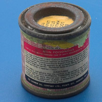
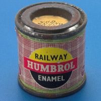
Railway colours
|
 
|
| Era:
|
|
| Tin shown:
| ? (Ricardo Dacoba)
|
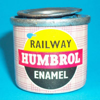
| Front:
| logo consisting of a yellow and black circle with a red horizontal bar with 'Humbrol' text. 'Railway' text in yellow part, 'Enamel' text in black part. Tartan-like background in pink and red.
|
| Back:
| instructions in English
|
| Label:
| printed on tin
|
| Lid:
| bare metal with paper sticker
|
| Comments:
| bottom is attached with a flange, this is not a deep drawn tin
|
|
 
|
| Era:
|
|
| Tin shown:
| ? (John Walker)
|
| Front:
| same as previous tin design
|
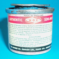
| Back:
| top row text: "Authentic - HOC (in logo) - Semi-matt". Instructions in English
|
| Label:
| printed on tin
|
| Lid:
|
|
| Comments:
| deep drawn tin with integral bottom
|
|
Authentic Railway colours
|
 
|
| Era:
| 1968 flyer, 1972 included
|
| Tin shown:
| HR104 GWR Standard Loco Green (Lee Harris)
|
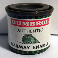
| Front:
| horizontal bar with 'Humbrol' text, 'Authentic' and 'Railway enamel' texts split by a green locomotive. Bands of green and black squares circle the tin, rest is white
|
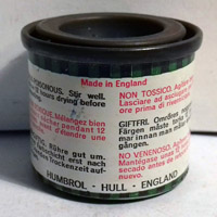
| Back:
| brief instructions in six langauges (English, French, German, Italian, Swedish, Spanish)
|
| Label:
| printed on tin
|
| Lid:
| paint colour
|
| Comments:
| the range consisted of 8 sets of 6 colours each, with HRxxx numbers. The tins were available individually or as sets of 6; these sets had instructions included describing their use.
|
|
Scenic Paint
|
 
|
| Era:
|
|
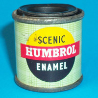
| Tin shown:
| ? (John Walker)
|
| Front:
| logo consisting of a yellow and black circle with a red horizontal bar with 'Humbrol' text. 'Scenic' text in yellow part, 'Enamel' text in black part. Tartan-like background in very light and medium green
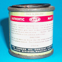
|
| Back:
| top row text: "Authentic - HOC (in logo) - Matt". Instructions in English
|
| Label:
| printed on tin
|
| Lid:
| bare metal with paper sticker in colour, with colour name only
|
| Comments:
| bottom is attached with a flange, this is not a deep drawn tin
|
|
 
|
| Era:
|
|
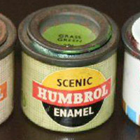
| Tin shown:
| Grass Green (Ebay)
|
| Front:
| same as previous tin design
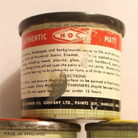
|
| Back:
| approximately similar to the above tin. Text in black bar now single-line.
|
| Label:
|
|
| Lid:
| bare metal with paper sticker in colour, with colour name only
|
| Comments:
| deep drawn tin with integral bottom
|
|
International Racing colours
|
 
|
| Era:
| introduced 1965, shown in 1965 and 1966 advertisements
|
| Tin shown:
| R303 B.R.M. Green (Eric Verschuur)
|
| Front:
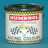
| yellow/black checkers band, Humbrol logo in red and white, 'international' in black, a yellow street car with two finish flags, 'Racing Colours' text, yellow/black checkers band
|
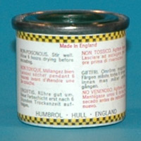
| Back:
|
|
| Label:
| printed on tin
|
| Lid:
| paint colour
|
| Comments:
| released alongside 'Authentic Railway colours'. Introduction advertisement list twelve colours.
|
|
 
|
| Era:
|
|
| Tin shown:
| R309 Metallic Green
|
| Front:
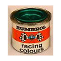
| Humbrol logo in black, red band with front view of a 'sixties single-seater and two finish flags, 'racing colours' text
|
| Back:
|
|
| Label:
|
|
| Lid:
| paint colour
|
| Comments:
| Likely the second tin style. Photo credit: Sean Rothman
|
|
 
|
| Era:
|
|
| Tin shown:
| R310 Metallic Red
|
| Front:
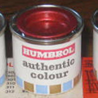
| standard Authentic Colour tin
|
| Back:
|
|
| Label:
|
|
| Lid:
| paint colour
|
| Comments:
| HC310 stamped on the lid, refill box marked 'Metallic Red R810'. Photo credit: T-shirt Tony
|
|
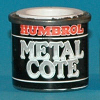
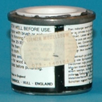
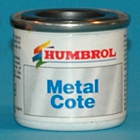
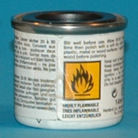
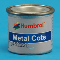
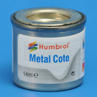
Metal Cote
|
 
|
| Era:
| 1985 advertisement says they were new
|
| Tin shown:
| 8188 Steel (Rob de Bie)
|
| Front:
|
|
| Back:
|
|
| Label:
| printed on tin
|
| Lid:
| white with paper sticker
|
| Comments:
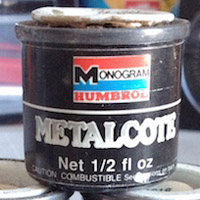
| six colours, later reduced to four (gold and bronze deleted). Introduced when the standard range tins first had 'Color' instead of 'Enamel'
|
|
 
|
| Era:
| roughly 1995, similar to first regular tin with 'paint scrible' Humbrol logo, but pre 'Super Enamel'
|
| Tin shown:
| 27004 Gun Metal (Eric Verschuur)
|
| Front:
| Humbrol logo enhanced with multi-coloured paint 'scribble' on the left side
|
| Back:
|
|
| Label:
| sticker over shrink foil
|
| Lid:
| paint colour
|
| Comments:
| 5-digit number instead of 4-digit number, not related
|
|
 
|
| Era:
| 2002 included
|
| Tin shown:
|
|
| Front:
| completely redesigned label, equivalent of one from the standard ranges
|
| Back:
|
|
| Label:
|
|
| Lid:
| shrink foil ?
|
| Comments:
|
|
|
 
|
| Era:
| 2013 included
|
| Tin shown:
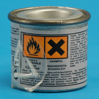
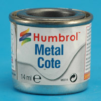
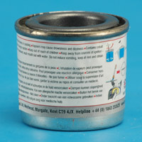
| 27001 Aluminium (Rob de Bie)
|
| Front:
| again a completely redesigned label, medium grey background with a 'metallic' blue band with 'Metal Cote'
|
| Back:
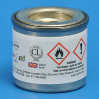
| instructions and safety warnings in English and German. No logo for Hornby, just the text 'Hornby Hobbies'
|
| Label:
| paper sticker
|
| Lid:
| paint colour
|
| Comments:
| a transparent plastic warning label with a raised triangle (for the blind probably) added to the rear side
|
|
 
|
| Era:
| 2016 included
|
| Tin shown:
| 27003 Polished Steel (Rob de Bie)
|
| Front:
| again a completely redesigned label, with a light gray instead of blue 'wave' at the bottom
|
| Back:
| covers 2/3rds of the tin now. Left side contains mainly safety warnings in English, French and Dutch in a red rectangle, red and yellow Hornby logo at the bottom. Right side has the same pictograms as before, plus UK flag and 'Made in the UK' text
|
| Label:
| paper sticker
|
| Lid:
| paint colour
|
| Comments:
|
|
|
 
|
| Era:
| 2021 ?
|
| Tin shown:
| 27004 Gun Metal (Rob de Bie)
|
| Front:
| slight redesign of the label, that became more narrow
|
| Back:
| pictograms for mixing/shaking and drying, safety warnings, Hornby logo and company data
|
| Label:
| sticker that partially covers the tin, with a peel-back layer for safety information in English, French, German, Dutch, Swedish, Italian and Spanish
|
| Lid:
| bare metal with a coloured sticker, with tin number in white lettering
|
| Comments:
|
|
|
Polyurethane
|
 
|
| Era:
| 1978 included
|
| Tin shown:
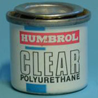
| H35 Gloss Varnish (Eric Verschuur)
|
| Front:
| vertical blue bar positioned left of center and interrupted by white on red Humbrol logo and black 'CLEAR polyurethane' text, the word CLEAR in black outline.
|
| Back:
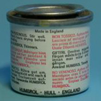
| two columns of text in six languages on rear side: English, French, German, Italian, Swedish and Spanish. 'NON-POISONOUS. Stir well.' in text.
|
| Label:
| printed on tin
|
| Lid:
|
|
| Comments:
| unlike the other gloss enamel colours, this gloss clear was claimed to be resistant to model airplane fuels (containing nitromethane) hence the different label on the front of the tin. The lid was stamped 'CLEAR 35'. From the same era as the first pictured tin in the standard range.
|
|
Fluorescent Paint
|
 
|
| Era:
| 1958 advertisement
|
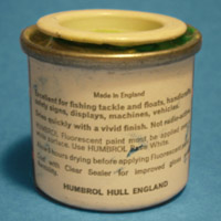
| Tin shown:
| Saturn Yellow
|
| Front:
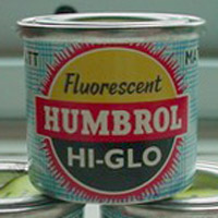
| 'Fluorescent' and 'Hi-Glo' texts, in a circle with 'light rays' around it. 'MATT' texts left and right. Tartan-like background in blue, indicating matt paint.
|
| Back:
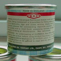
| English instructions only. HOC logo at top.
|
| Label:
| probably printed
|
| Lid:
|
|
| Comments:
|
|
|
 
|
| Era:
|
|
| Tin shown:
|
|
| Front:
|
|
| Back:
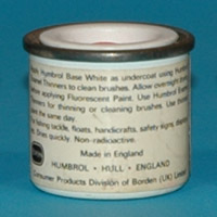
| instructions: must be painted on Base White, and thinned with (nitro) cellulose thinner.
|
| Label:
| sticker
|
| Lid:
|
|
| Comments:
| Borden era. Had no numbers assigned. The standard range matt white was changed later so it could be used too as a base for fluorescent paint.
|
|
 
|
| Era:
| 1968 flyer
|
| Tin shown:
| gloss blaze (John Walker)
|
| Front:
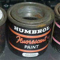
| 'Humbrol' in white, 'Fluorescent' in script lettering, 'PAINT' in a simple font, bands above and below, 'GLOSS' at the bottom. It seems the bands and 'Fluorescent' are always in red.
|
| Back:
| unknown
|
| Label:
| appears to be a paper sticker
|
| Lid:
|
|
| Comments:
| the lid label missing from the tin pictured
|
|
 
|
| Era:
| probably as above
|
| Tin shown:
| Signal Green (Leif Hellström)
|
| Front:
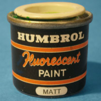
| same as above but 'Matt' instead of 'Gloss' at the bottom
|
| Back:
|
|
| Label:
|
|
| Lid:
|
|
| Comments:
|
|
|
 
|
| Era:
| probably as above
|
| Tin shown:
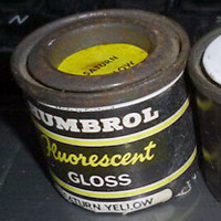
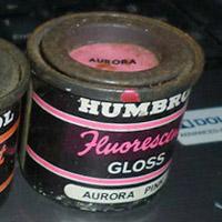
| Saturn Yellow and Aurora Pink
|
| Front:
| 'Humbrol' in white, 'Fluorescent' in script lettering, 'GLOSS' in a simple font, bands above and below. The bands and 'Fluorescent' are in the colour of the paint
|
| Back:
| unknown
|
| Label:
| appears to be a paper sticker
|
| Lid:
| bare metal with paper sticker in colour
|
| Comments:
|
|
|
 
|
| Era:
|
|
| Tin shown:
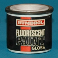
| 207 Gloss Fluorescent Aurora Pink (Eric Verschuur)
|
| Front:
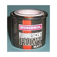
| black and red with Humbrol logo and 'Fluorescent paint gloss' text
|
| Back:
| instructions changed to: must be painted on Base White (206), and can be thinned with Humbrol Enamel Thinner
|
| Label:
| sticker
|
| Lid:
| white with paper sticker in colour
|
| Comments:
| Borden era. Paint composition apparently changed. Range now includes gloss fluorescent colours. Assigned a number in the standard range (192-209 range)
|
|
 
|
| Era:
|
|
| Tin shown:
| 207 Gloss Fluorescent Aurora Pink (Eric Verschuur)
|
| Front:
| same as above, but 'MATT' instead of 'GLOSS'
|
| Back:
| likely similar
|
| Label:
|
|
| Lid:
| white with paper sticker in colour
|
| Comments:
|
|
|
 
|
| Era:
|
|
| Tin shown:
| 203 Matt Fluorescent Signal Green (Eric Verschuur)
|
| Front:
| identical to the tin in the standard range
|
| Back:
| instructions changed to standard text without special instructions
|
| Label:
| printed on tin
|
| Lid:
| white with paper sticker in colour
|
| Comments:
| Borden era
|
|
Glow Paint
|
 
|
| Era:
|
|
| Tin shown:
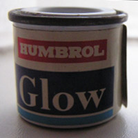
| #? (Rob van Riel)
|
| Front:
| standard Humbrol logo, large dark blue rectangle with 'Glow' text, followed by a light blue band
|
| Back:
| text 'Stir thoroughly. Apply thin coat over matt white base. For exterior use recoat with clear varnish after 24 hours'
|
| Label:
| sticker over tin like 105 (currentlty the sixteenth tin in the standard range)
|
| Lid:
|
|
| Comments:
| tin was packaged in a cardboard box. One use was formation ('slime') lights on US jets. After years they still glow in the dark!
|
|
 
|
| Era:
| roughly 1995, similar to first regular tin with 'paint scrible' Humbrol logo, but pre 'Super Enamel'
|
| Tin shown:
| #? (I8534)
|
| Front:
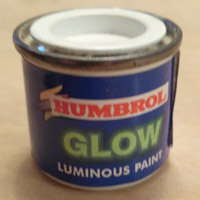
| dark blue with greenish-glowing text 'Glow', red Humbrol text with small colour 'scribble' at left top
|
| Back:
|
|
| Label:
| paper sticker
|
| Lid:
|
|
| Comments:
|
|
|
Clear colour
|
 
|
| Era:
| roughly 1995, similar to first regular tin with 'paint scrible' Humbrol logo, but pre 'Super Enamel'
|
| Tin shown:
| ? (internet)
|
| Front:
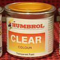
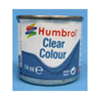
| white background with 'paint scrible' Humbrol logo, large 'CLEAR' and small 'COLOUR' in orange-to-yellow rectangle, very small 'transparant paint' at the bottom
|
| Back:
|
|
| Label:
| unknown
|
| Lid:
| paint colour
|
| Comments:
| appears printed on tin
|
|
 
|
| Era:
|
|
| Tin shown:
| 1321 clear amber (internet)
|
| Front:
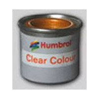
| grey or metallic background with 'paint scrible' Humbrol logo and 'Clear Colour' in orange in a white rectangle
|
| Back:
|
|
| Label:
| appears printed on tin
|
| Lid:
| paint colour
|
| Comments:
|
|
|
 
|
| Era:
| 2017 on
|
| Tin shown:
| ? (internet)
|
| Front:
| similar to the 2017 standard tin: blue wave, 'Enamel' in blue, 'Humbrol' in red, similar to previous designs
|
| Back:
|
|
| Label:
| sticker, partially covering the tin
|
| Lid:
|
|
| Comments:
|
|
|
Revell paint made by Humbrol
|
 
|
| Era:
| pre 1979
|
| Tin shown:
| R49 (Eric Verschuur)
|
| Front:
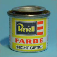
| Revell logo in yellow, white, black and red on a rectangular yellow background, then red text FARBE on white and lastly black text 'NICHT GIFTIG' on white square over yellow background
|
| Back:
| Four columns of text on rear side: German, English, Swedish and Italian. Two red bars spanning two columns each with white text, the first one reading 'Auch für Holz, Glas u. Keramik' the second one carrying the Humbrol logo. Below the red bars french text is spread out.
|
| Label:
| printed on tin
|
| Lid:
|
|
| Comments:
| this Revell tin ended up being used (accidentally?) by Humbrol, and was distributed in a batch of Humbrol paint. The lid was stamped 'MATT 49', 49 being the Humbrol series code for matt clear.
|
|
Monogram paint made by Humbrol
|
 
|
| Era:
| 1985 included (advertisement FSM Sep/Oct 1985 p10g)
|
| Tin shown:
| #? (Rob van Riel)
|
| Front:
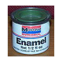
| Monogram logo in red, white and blue, Humbrol text in red in the usual font, red and blue stripes, texts 'Enamel', 'Net 1/2 fl oz' and 'Caution: combustible See cautions on back'
|
| Back:
| text in two columns, English only
|
| Label:
| printed on tin
|
| Lid:
| paint colour
|
| Comments:
| a short-lived co-opereration, that probably started in 1985. Range of 52 colours. Monogram models from that year included a leaflet offering three free tins, the offer expiring 31 December 1986.
|
|
 
|
| Era:
|
|
| Tin shown:
|
|
| Front:
|
|
| Back:
|
|
| Label:
|
|
| Lid:
|
|
| Comments:
|
|
|
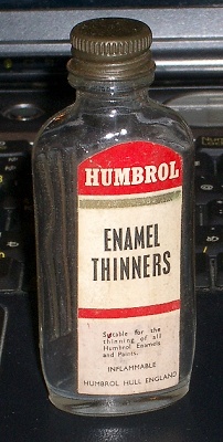
Glass bottles
|
 
|
| Era:
| 1958 advertisement
|
| Tin shown:
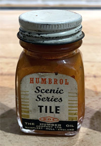
| Tile (Paul Digard)
|
| Front:
| 'Humbrol' text in the red logo type, 'Scenic Series' in shorthand, colour name in a sans serif font, HOC logo, all borded by golden stripes of diminishing widths. Company information in the black band at the bottom
|
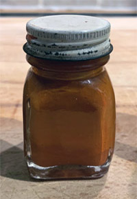
| Back:
| n/a
|
| Label:
| paper
|
| Lid:
| white paint
|
| Comments:
| the glass bottles appear to have been a short-lived parallel range of the modelers paint tinlets. Note that no numbers were used. Twelve colours were available in the Scenic Series: Black, Concrete, Earth, Foliage Green, Grass Green, Red Brick, Slate, Stone, Tarmac, Tile, Wood, Yellow Brick. Colours are reportedly semi-matt
|
|
 
|
| Era:
| 1958 advertisement
|
| Tin shown:
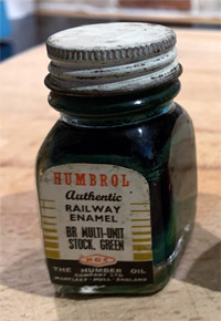
| BR Multi-Unit Stock. Green (Paul Digard)
|
| Front:
| as above, but with 'Authentic Railway Enamel'
|
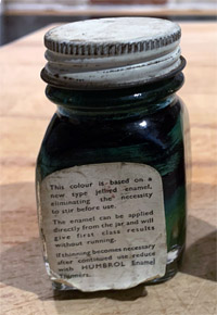
| Back:
| directions for use. Mentions that the paint is a "new type jellied enamel, eliminating the neccesity to stir before use"
|
| Label:
| paper
|
| Lid:
| white paint
|
| Comments:
| twenty colours were available, but no list has been found so far
|
|

