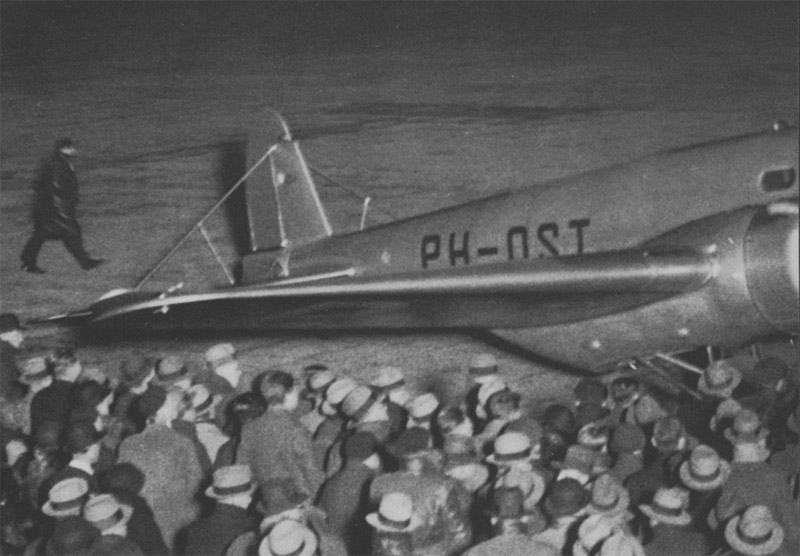
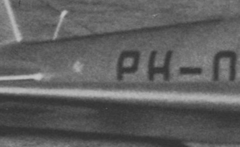
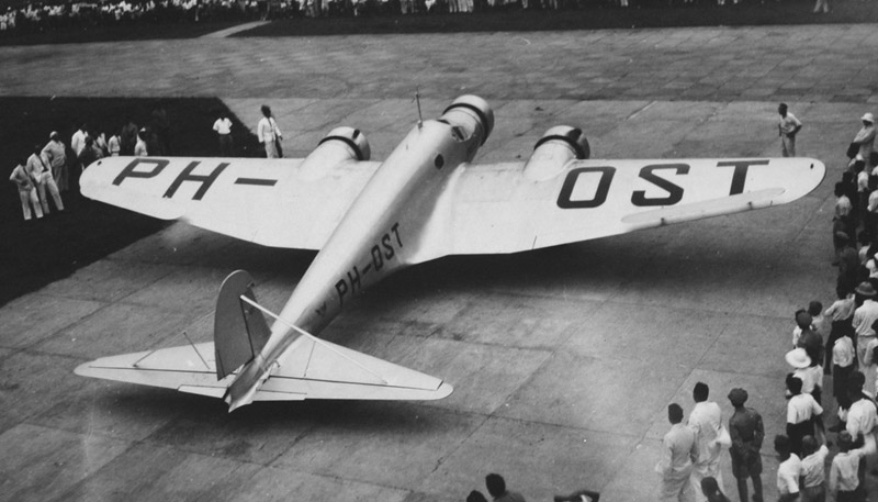
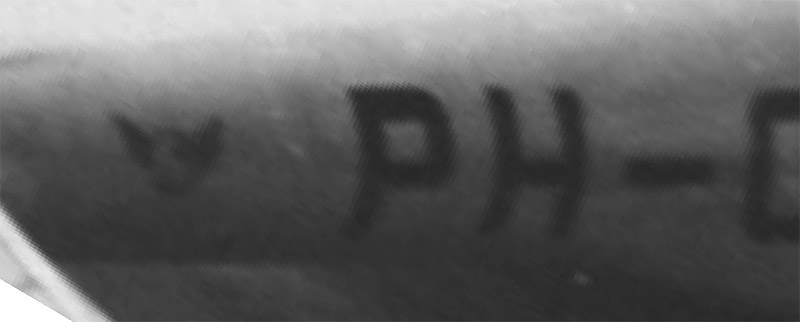
| The Pander Postjager had a two different logos on the rear fuselage that has not been identified so far. Presented here is all the research material that I found. If you any idea, please contact me: Rob de Bie. |
The right side logo is hardly visible at departure, when it definitely already had it. That could hold a clue about the colors used. My best guess so far is blue and gold.

| 
|
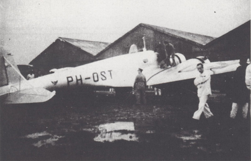
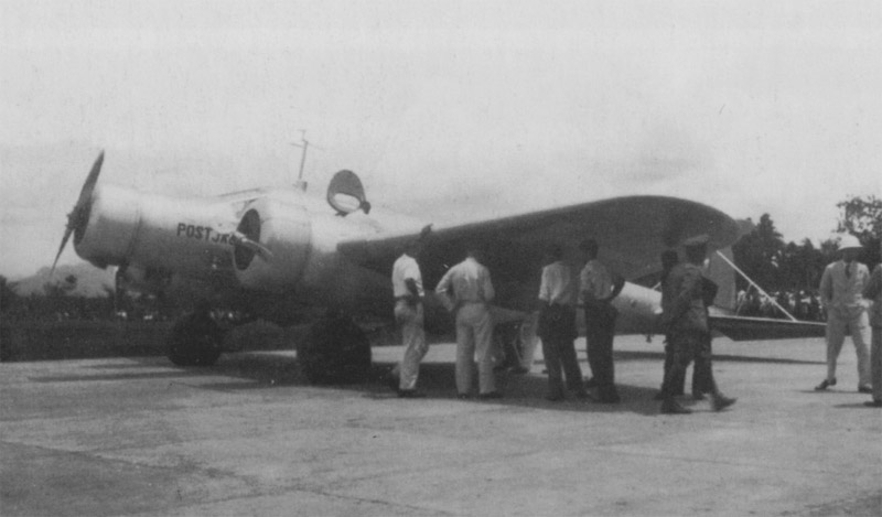
Refueling stop, at a rain-soaked airfield. The right-side logo is clearly visible.
| 
|
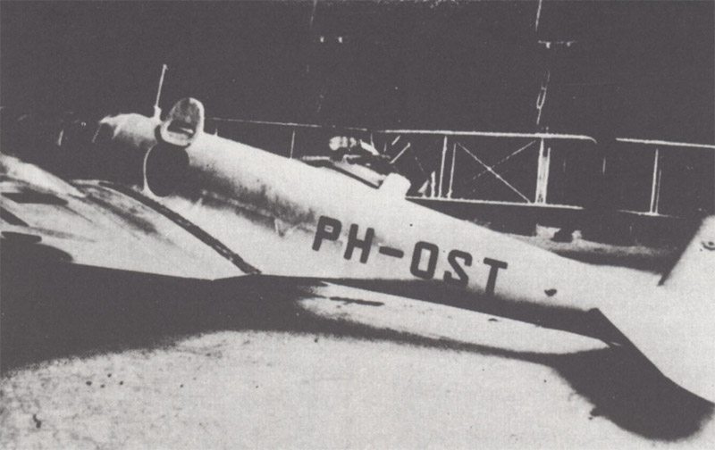
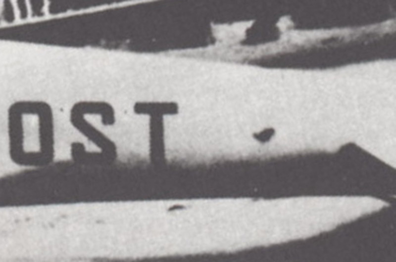
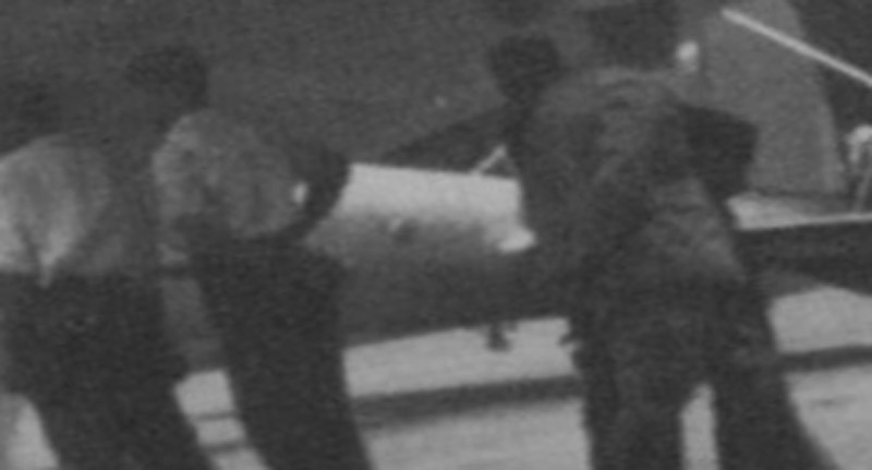
One engine ran dry of oil, requiring a long stay while waiting for a new engine to arrive from the USA. To my eye, the left-side logo looks very different to that seen on the right side. It has a modified 'Ying-Yang' symbol look if you squint your eyes.
| 
|
Refueling stop.
| 
|
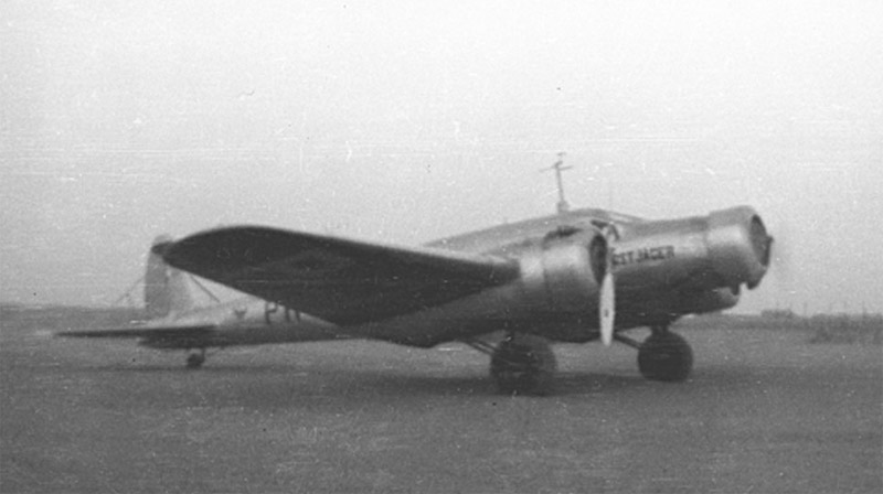
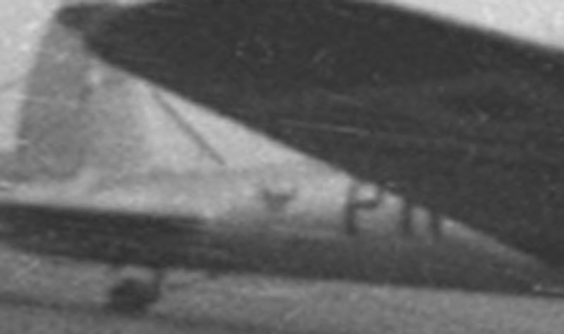
Arrival at the destination. Rights-side and left-side logos can be seen quite clearly.
| 
|
| 
|
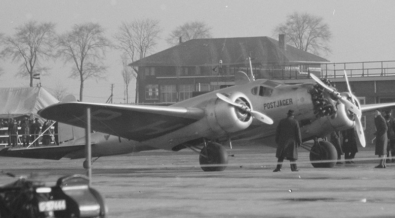
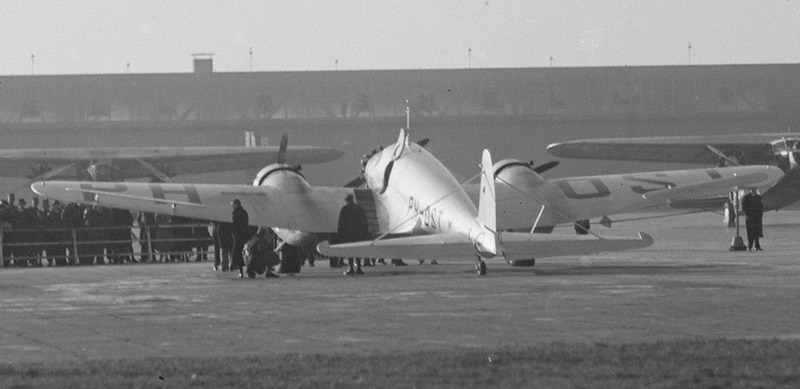
Two excellent photos of the arrival at Schiphol, that appears to show identical logos on either side. Again I think the different appearance of the logo in all 16 photos is caused by different types of film, that respond differently to colors. Sources: NIMH Beeldbank and NIMH Beeldbank.
| 
|
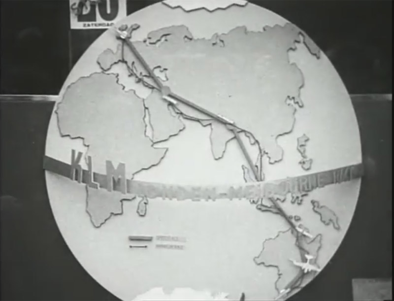
A globe with the intended route, as seen in YouTube: KLM 18. London-Melbourne race, would be a possibility. It roughly matches the yin-yang impression of the left-side logo, but not very well.
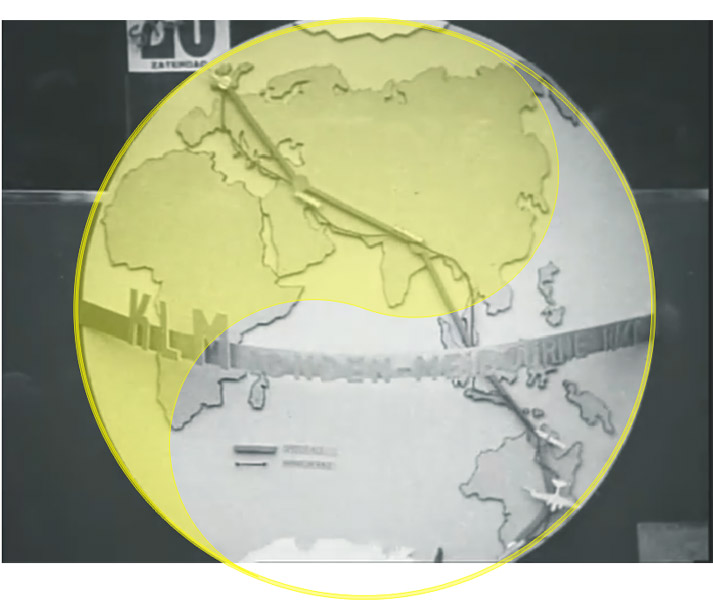
This variation, found as a Wikipedia photo fits the yin-yang impression of the left-side logo better. However, the orientation of the colors is reversed.
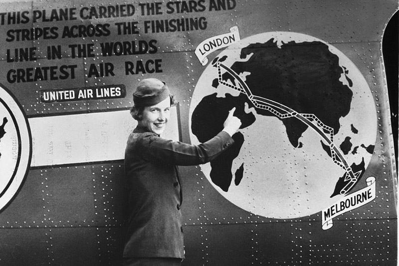
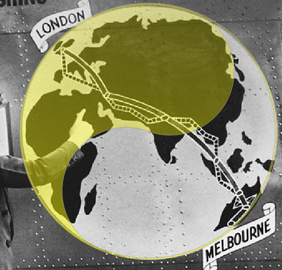
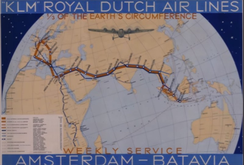
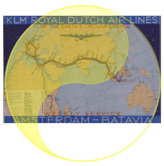
The map below was seen here: YouTube: Fokker 1910-1940. If the shapes are simplified greatly, a sort-of yin-yang figure can be seen, as in the left-side logo.
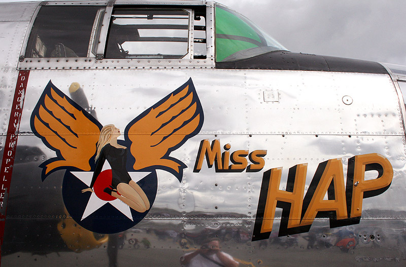
Another helpful person noted that the upward-pointing wings resembled those seen on Hap Arnold's B-25, as seen here.
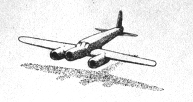
My first guess was the logo of the organising commitee: 'Studie-comité Snelpost Nederland-Indië'. Its logo was a Postjager, not much point to paint that on the aircraft.
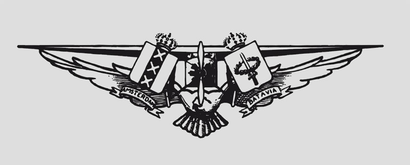
The 'Comité Vliegtocht Nederland-Indië' was another, older committee (at least dating 1923), that gave general support only, and it had supported other flights. The logo was found on a letter reproduced on page 141 of Hooftman's book. But the shape does not match.
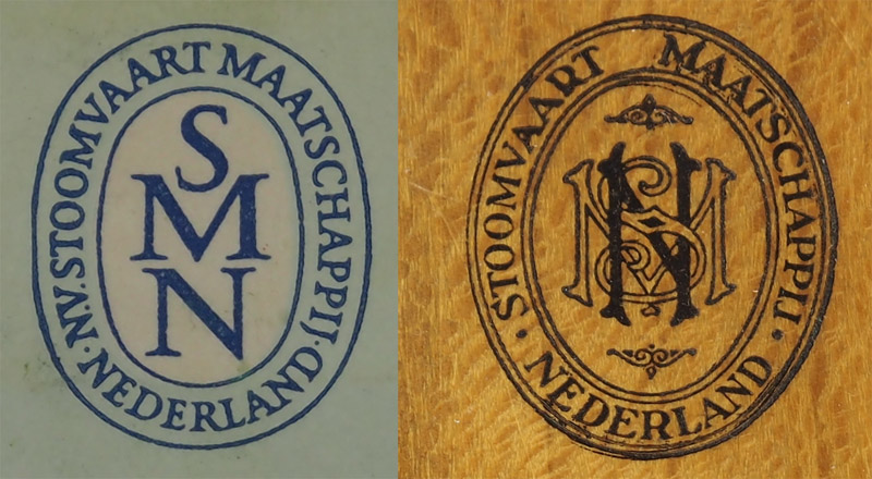
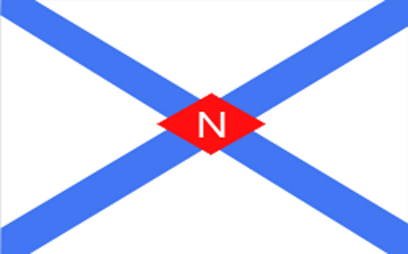
Stoomvaart Maatschappij 'Nederland' (SMN). Top: variations of the company logo (dating unknown), bottom the ship 'house flag'.
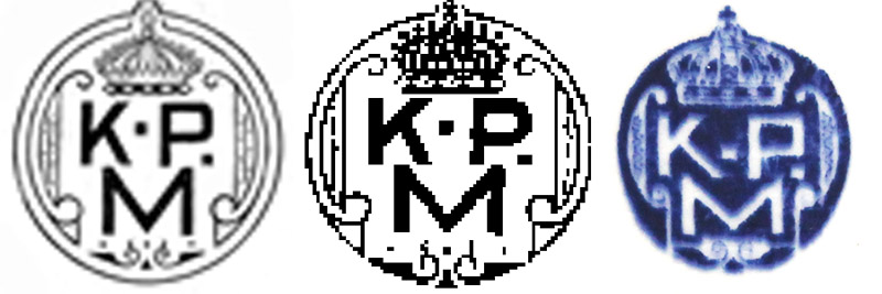
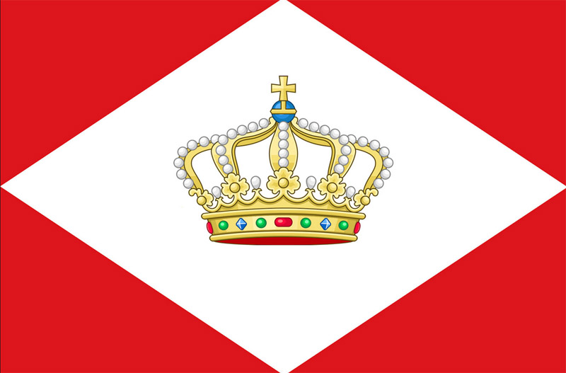
Koninklijke Paketvaart Maatschappij (KPM). Top: variations of the company logo, bottom the ship 'house flag' (1935 use confirmed).
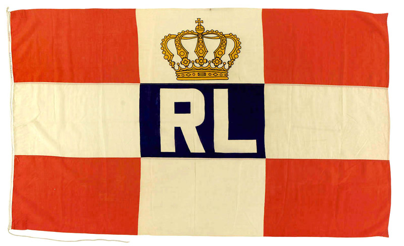
Rotterdamse Lloyd. Top: company logo from 1947 or later, bottom the ship 'house flag' (1935 use confirmed).

Bataafsche Petroleum Maatschappij (BPM). Logo
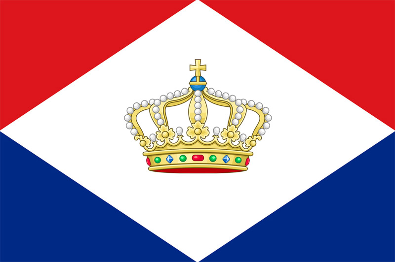
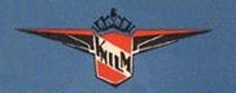
Koninklyke Nederlandsch-Indische Luchtvaart Maatschappy (KNILM). Logo
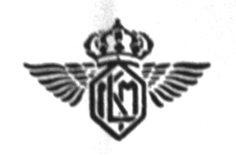
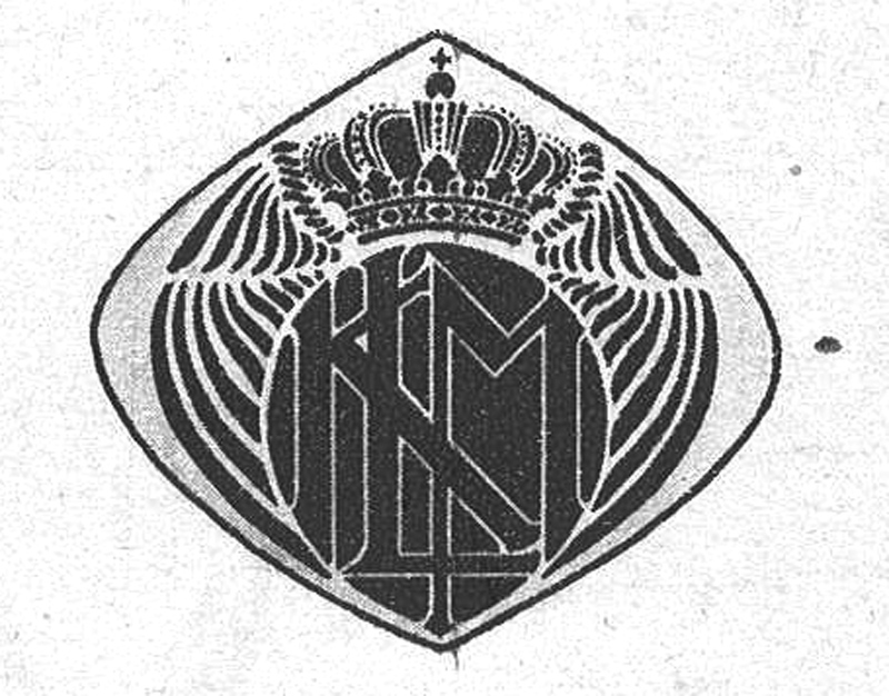
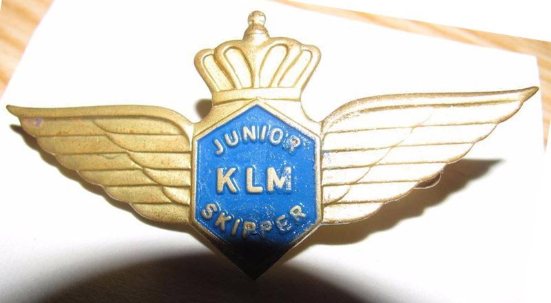
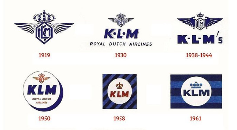
Koninklijke Luchtvaart Maatschappij voor Nederland en Koloniën. Original name of KLM. Top: logo from 1932 letter by Plesman (28601). Bottom: logo on photo of ir. Wolff (RSL). Most unlikely to be used on the aircraft, since director Plesman did not believe in post flights, and saw them as competition for his lucrative post-carrying business.
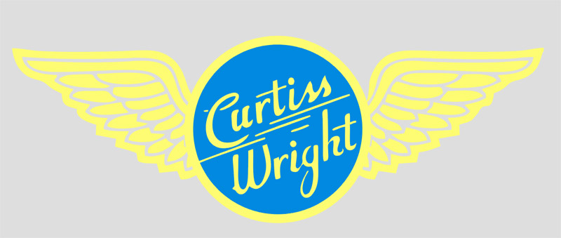
The Curtiss-Wright logo (copied from a lapel pin) might be a reasonable fit. But the location is not logical, why not apply these to the nacelles?
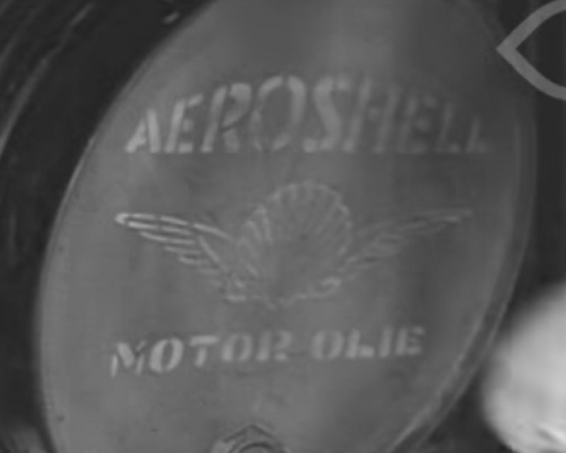
The Aeroshell logo would be an option, but does not match the shape.
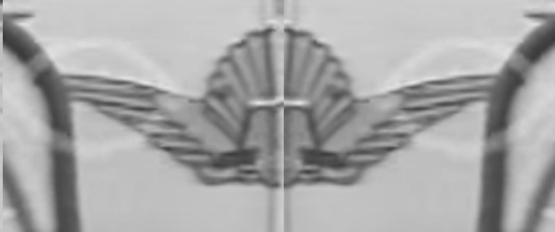
The Rijks-Studiedienst voor de Luchtvaart (RSL) did not have a logo until years after WW2.
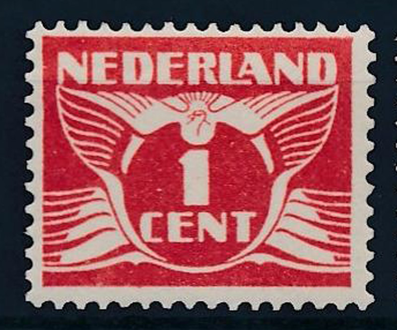
This Dutch stamp design (Vliegende Duif) might also be a match. Despite the dove it has no link with air mail.
Yet another shape that possibly fits, but without the crown. If KLM is an option, than KNILM is another option. Or Bataafse Petroleum Maatschappij, or Luchtvaartafdeling (LVA)
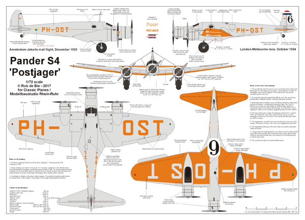
Starting with the Postjager drawing by C. ter Horst (NVM), I made a completely revised drawing based on research in archives. It's not done yet, so it's shown in a small size here.
